Digihallo Official Blog
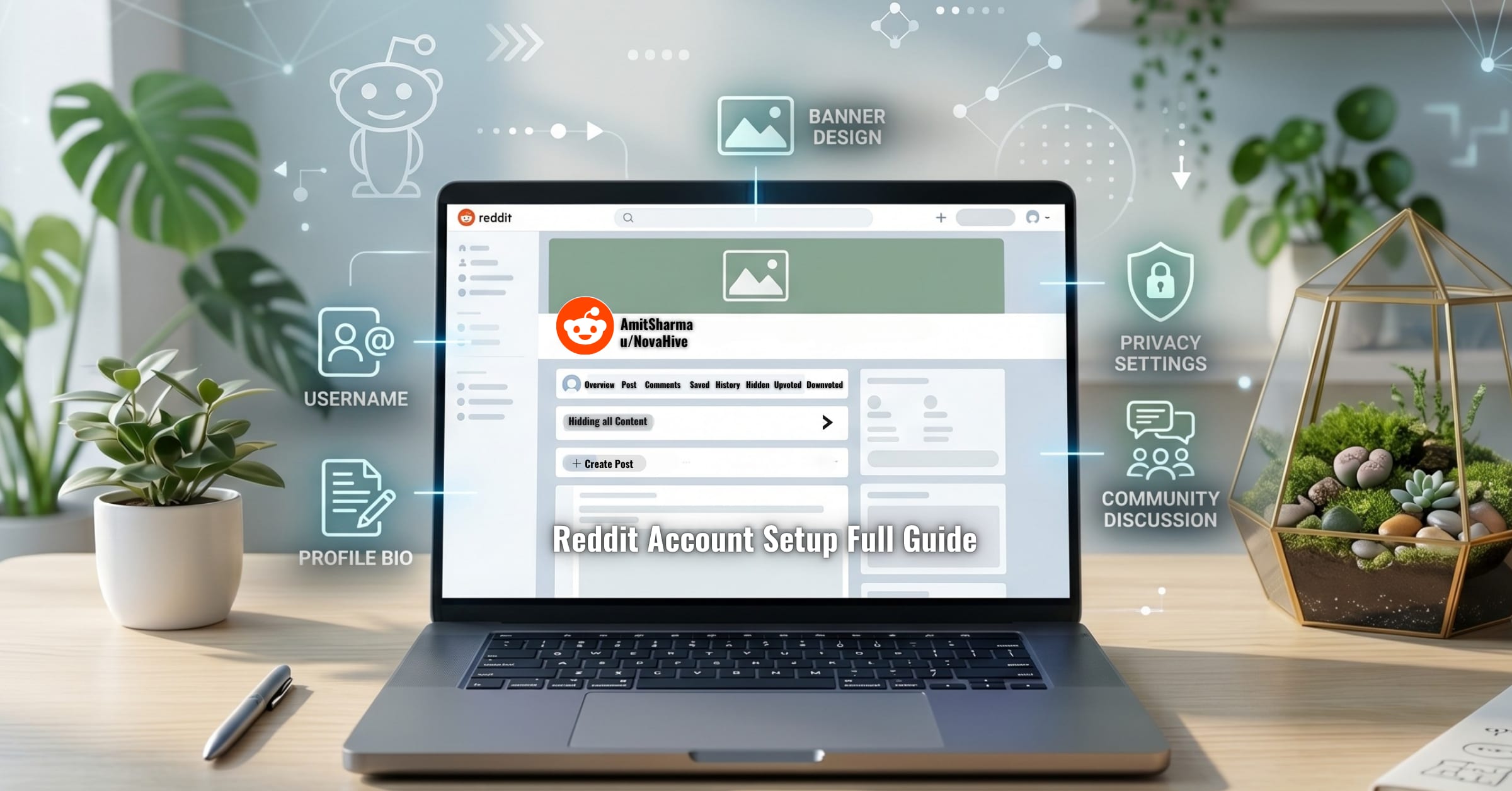
Reddit Account Setup Guide: Beginner to Advanced
Learn how to create a Reddit account the right way from beginner to advanced level. Step-by-step guide to choose a safe username, write a professional bio, set banner size, configure privacy settings, avoid spam bans, and grow karma safely.
Read More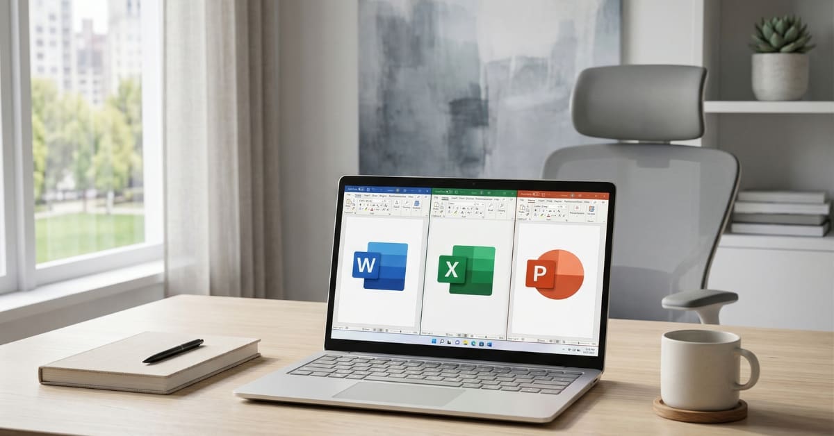
Download Original Microsoft Office for PC (Official Guide)
Download Microsoft Office 2024 LTSC for free using official Microsoft tools. Step-by-step guide to install, activate safely, and avoid cracked versions with lifetime access.
Read More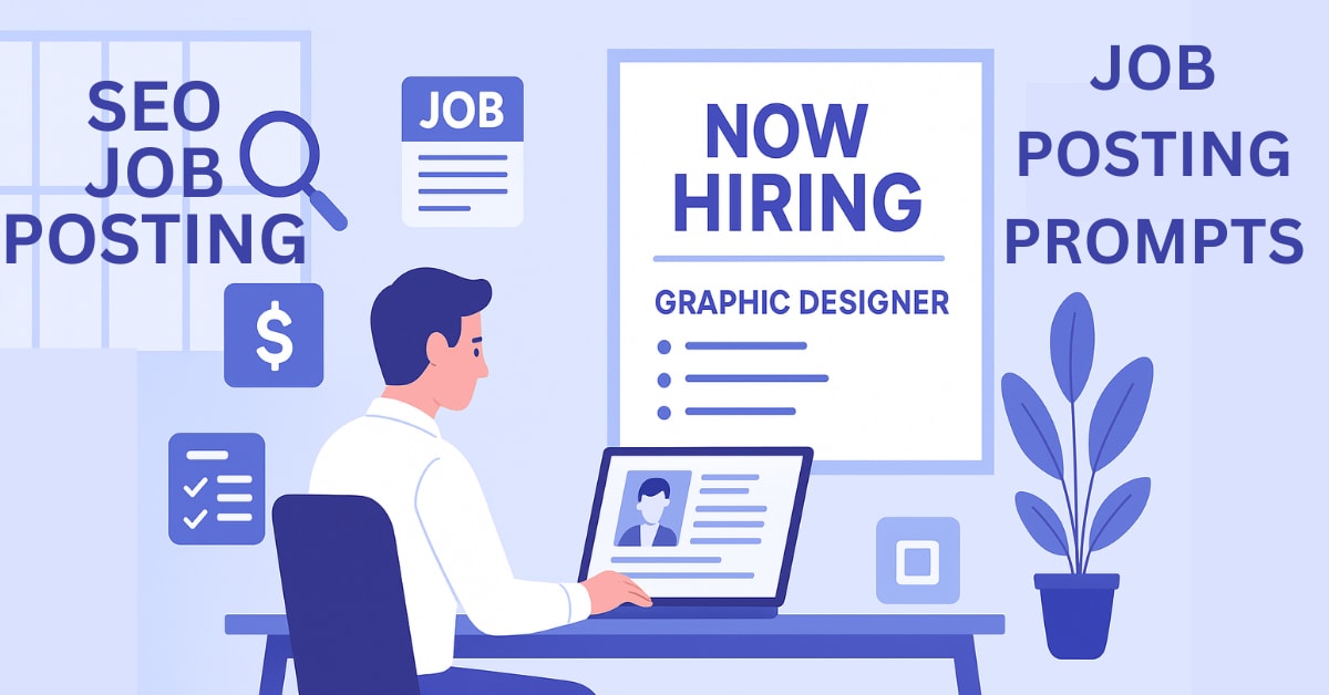
How to Write Job Descriptions With AI
Learn how to write compelling job postings that attract the right talent. Includes AI prompts for LinkedIn, Naukri & Indeed. Perfect for HR teams and recruiters.
Read More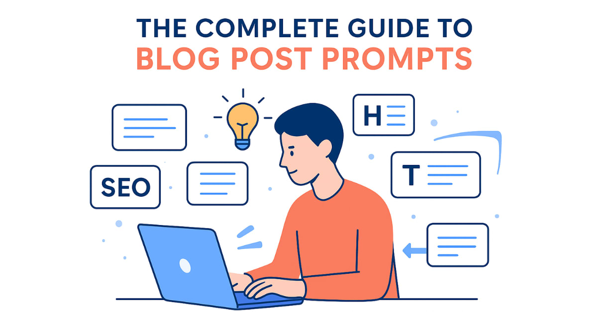
AI SEO Prompts for Full Blog Posts Writing
Stop struggling with blog posts that don't rank! This complete guide teaches you how to find profitable keywords using free tools, structure SEO-optimized articles, and write AI prompts that generate perfect content. Includes 8 copy-paste-ready prompts for keyword research, title creation, outline generation, section writing, and even AI image creation for blog graphics. Learn proper heading hierarchy, keyword placement, meta description writing, and quality checks. No guesswork—just a proven system that works! Get all prompts and start ranking on Google today...
Read More
How to Create and Sell Responsive Code Packages with AI
Learn how to create & sell responsive code packages for WordPress, Shopify & Blogger—no coding skills needed. Use these AI-powered prompts to generate multi-platform-ready code, marketplace listings, and free templates. Copy-paste the exact prompts into ChatGPT/Gemini to get tested, production-ready code instantly. Includes full-width Blogger fixes, SEO optimization, and step-by-step integration guides. Perfect for freelancers, agencies, and digital product sellers. Save hours of development time & start selling today...
Read More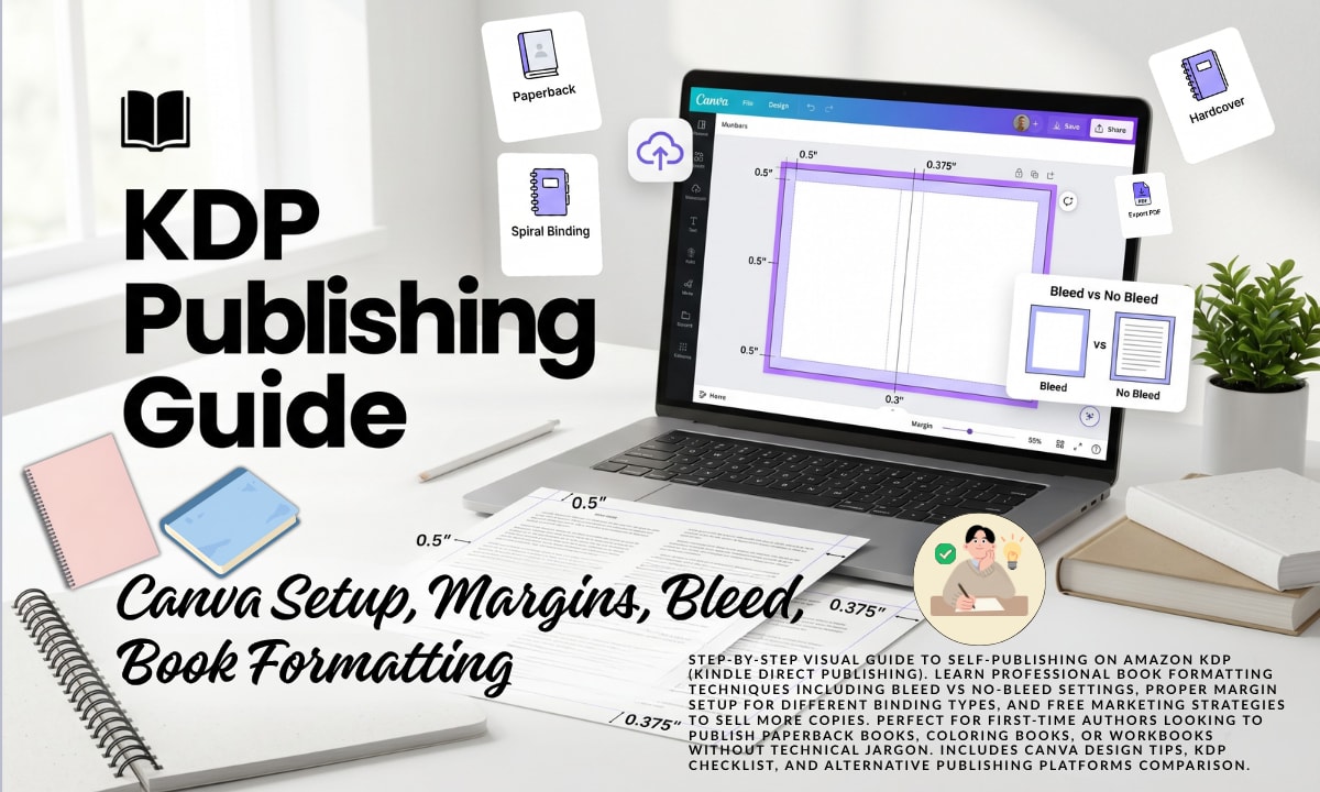
Complete Beginner Guide to Publishing Books on KDP
Step-by-step visual guide to self-publishing on Amazon KDP (Kindle Direct Publishing). Learn professional book formatting techniques including bleed vs no-bleed settings, proper margin setup for different binding types, and free marketing strategies to sell more copies. Perfect for first-time authors looking to publish paperback books, coloring books, or workbooks without technical jargon. Includes Canva design tips, KDP checklist, and alternative publishing platforms comparison...
Read More
How to Host Images Online Free Without Breaking Links
Stop using Google Drive or sketchy free hosts that delete your files! This practical guide reveals two bulletproof solutions for permanent image hosting—tested over 7+ years on 200+ websites. Learn why Flickr beats every competitor (hint: it's been reliable since 2004), how to get direct image URLs in 2 minutes, and the proper way to embed images for lightning-fast loading. Includes real pro tips for photographers, e-commerce stores, and mobile users. Say goodbye to broken image icons forever...
Read More
Best Free Midjourney Alternatives for AI Image Generation
Want stunning AI art without paying for Midjourney? These five free tools deliver professional results—no subscription needed! From Leonardo.AI's 150 daily credits to Bing's instant four-image generation, each platform brings something special. Perfect for beginners and pros alike. No fancy computer required—everything runs in your browser, even on mobile. Learn which tool matches your needs, how to write better prompts, and whether you can sell your creations. Ready to unleash your creativity?...
Read More
100 Plus Best AI Tools Directory for Creators
I've personally tested and categorized these tools to help you quickly find exactly what you need. Discover 100+ must-have AI tools for creators, designers, and marketers! Bookmark this page as your go-to resource whenever you need a powerful tool to tackle your next creative project...
Read More
How to Use Free CDN for Blogger to Speed Up Your Website
How to Setup CDN with Blogger website fir free. This comprehensive guide will walk you through everything you need to know about using CDN (Content Delivery Network) for your Blogger website, as well as WordPress, Shopify, and other platforms...
Read More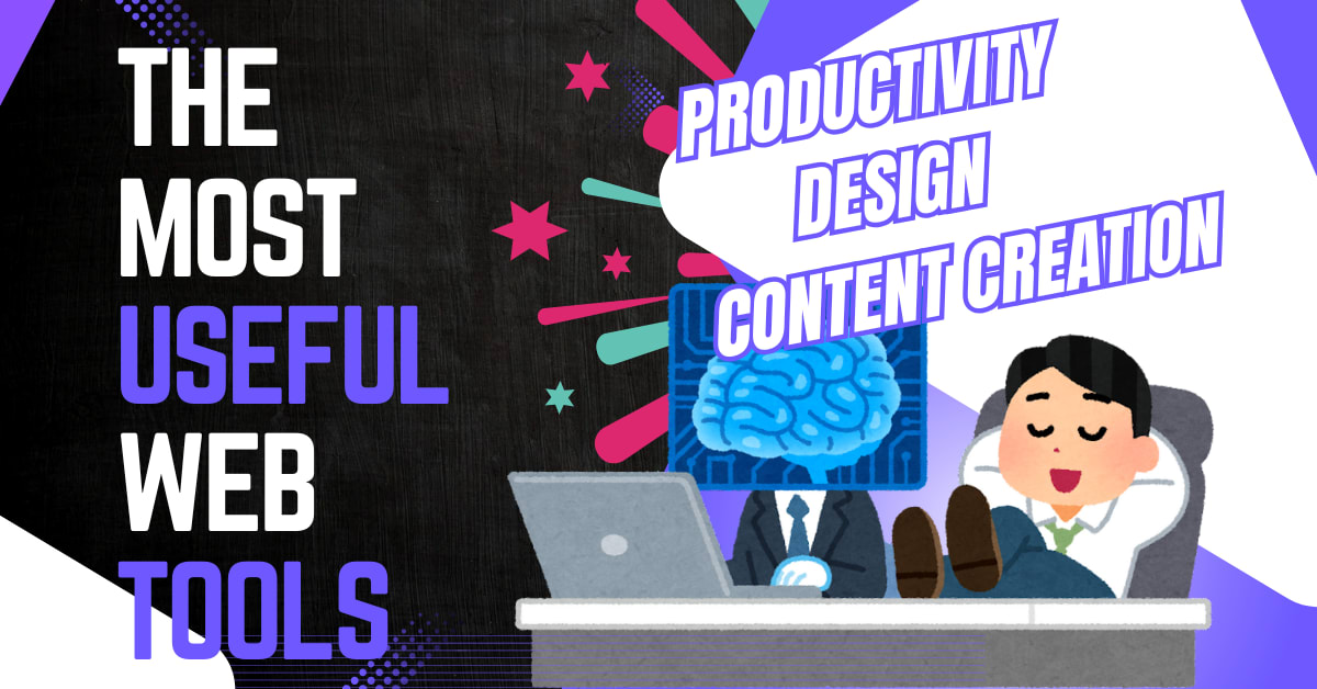
Best Free Web Tools for Creators, Designers and Developers
From Chrome extensions that save hours of work to AI website builders, video editors, and mind map creators—this ultimate collection has it all. Discover powerful tools for content writing, landing page creation, LinkedIn growth, data visualization, and eBook publishing. Each tool is hand-picked, free or freemium, and perfect for freelancers, designers, developers, and content creators. No coding skills required—just drag, drop, and create! Stop searching endlessly and start building smarter today...
Read More
Best Free AI Tools for Bloggers, Designers and Creators
Discover the ultimate collection of free tools for blogging, design, SEO, AI content writing, email marketing, and eCommerce photography—all in one place. From plagiarism checkers and keyword research to AI image generators, presentation makers, and mockup creators, we've got you covered. Every tool is personally tested and beginner-friendly. Save time, boost productivity, and create professional-quality work—without spending a dime. Whether you're a student, blogger, marketer, or designer, this is your must-have resource list!
👉 Explore now and take your work to the next level...
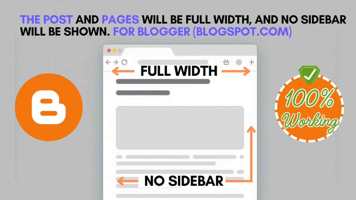
How to Make Blogger Theme Full Width Like WordPress
Blogger.com Theme full width just like in WordPress, without showing the slider. 100% working for any Blogger Theme...
Read More